MON - FRI: 08:00 - 05:00 PM

Accessorising your Interior
Accessories can make or break your interior.
A dull room can be brought to life with an injection of colourful or interesting items and a tired room can feel new and exciting with a cushion or two and a throw. They’re a great way to make simple changes across the seasons and a joy to put in place when you’ve finished a long, hard renovation project.
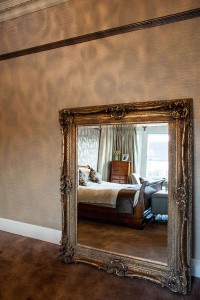
Mirrors will bounce light around your room, making it feel lighter, airier and if well positioned, larger too. If positioned poorly, they can feel a bit creepy (you might catch a movement and fear someone is in the room with you, and I’d think carefully about where they go in bedrooms!)
They can be large and impressive such as the image here, or can be a cluster of small mirrors. These look particularly good if they are either identical or they all have the same coloured frame (eg white) but are in a variety of styles (square, oval, Rococo, bevelled).
Mirrored cupboard doors can look stunning but are subject to smudges and will drive you nuts if you have small children you adore but an equal appreciation for shiny, polished surfaces.

Art
Sometimes, a single piece of art is all the decoration a room needs. In a white or neutral environment a large colourful picture can be the perfect focal point. The addition of some smaller items that pick up on the art’s colours (a selection of appropriately coloured fruit – eat or change often!, or a cushion or two) could enhance the art too.
Displaying art is an art unto itself. A central piece can be all the room needs or a more delicate balance of various rectangles might be in order. Symmetry is a much easier friend than asymmetry but it can feel formal too. Which do you prefer, informal or formal arrangements?
Sculpture/Objets d’arts

I’m not sure why we use the French for this term. Trinkets are certainly not the translation, trinkets feel much smaller and reek of Victoriana, whereas the French I suppose, lends a more sophisticated term to ‘things I liked the look of’. In my humble opinion, this needs to be ‘things I fell in love with’ as we should follow Morris’ advice and only fill our rooms with things of beauty. In a world so very full of choice, surely, you needn’t have things in rooms you dislike, never mind hate. Get rid of the atrocities. Do it now. Read not one word further until they have gone.
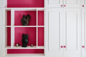
Note, these items don’t have to be expensive, you can display a collection of shells or driftwood and create a magnificent effect, equally a group of Faberge eggs could look cheap. How you display your objets is the answer – collections work well in a group rather than scattered around the room. Also consider their backdrop – will small items stand out against a fussy wallpaper? No, nor will light ornaments make an impression against a white wall. Contrast is the key.
Cushions
 Interior designers love cushions. We can’t help ourselves. They provide a fabulous opportunity to splash out on a bold fabric, something unusual that can be changed easily if you tire of it. Of course they have a functional role too (support, comfort etc) but for the most part I see these little treasures as the finishing touches – splashes of colour, texture and shape. Interior design confidence starts with cushions! So play!
If you feel your house isn’t quite finished, perhaps the family photos still haven’t been hung or there’s art or collectibles in the attic you really want to have on display, why not give me a call and we can see where they belong in your home. You’ll enjoy them far more if you can see them, I promise.
My contact details – to arrange a consultation:
niki@nsid.co.uk
07782 2656 444
- Category : Interior Design
- Type :


Comments
Just Say Your Opinion