MON - FRI: 08:00 - 05:00 PM
Interior Design Shows 2015
We parked in the sea of black BMWs and made our way into the UK’s number 1 interior design trade show; Decorex. It’s a ‘cannot be missed’ affair of sheepskin stools, textured walls, concrete and baths that require a mortgage of their own. But I was pleased not to miss it. Here are some highlights from Decorex & 100% Design. I’ve included some design tips and tricks on how to use them. PLEASE let me know whether you like them, love them or loathe them. There are no right or wrong answers. Just tell me what appeals.
Interior Design Exhibitions
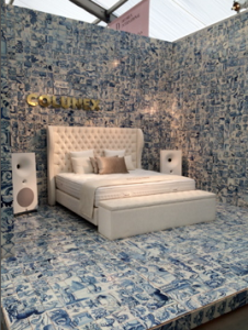 So often, exhibitors forget that exhibition space is VERY different from living space. (Much like graphic design is very different from fashion design, despite some key crossovers). To show off one’s wares well requires thought and good questions like “How will I stand out?” “How will I attract the attention of my key clientele?” These are not usually the questions asked by home owners, who may want one or two items to stand out but probably don’t want to create a showroom.
While this would never work at home, well certainly not in this country (a tiled bedroom…) I think it’s a fabulous way to show off the crisp whiteness of the bed, its headboard and of course the speakers. And just a single splash of taupe…
The Dutch style blue & white tiles are more suitable for bathrooms and kitchens, of course, but had they used carpet and a ‘normal’ wall covering, they’d have been tempted to simply create a room set. And we’d have walked straight past.
So this caught my eye.
Wall Coverings
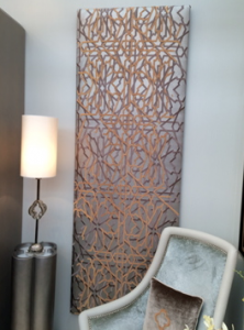 What an amazing wall hanging! It is a padded leather, embroidered in a metal thread to create a 3D and very textural piece of art. The same method has also been used on the cushion in a much simpler pattern.
I love to use fabrics, rugs and wall hangings on walls. They cover large spaces well without costing what large pieces of art can cost. They can also be moved (fold up even!) and are therefore much more flexible than a piece of art.
If you’re stuck with a bare white wall then a rug can do wonders (speak to a framing company to help you create battens to hang it from).
Note the repeat pattern used in the embroidered shape on the cushion, the shape of the pedestal table and the base of the table lamp. Do you have a favourite shape?
Repeating shapes is a key design trick. It is pleasing on the human eye and mind to see repetition. So have a quick de-clutter…
Texture in Design
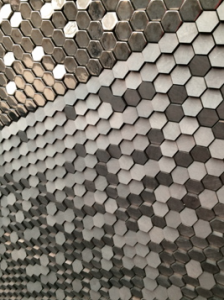
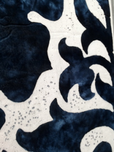
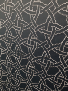 Texture is another key tool used by the interior designer and frequently forgotten by her/him ‘indoors’.
If you like a simple colour palette then texture is a must.
Here are hexagonal tiles that will reflect light and appear to shimmer.
The blue and cream is actually a mix of concrete and velvet and is screaming to be used in a hotel and the third is another feature tile for those in favour of greys and creams.
Would you add a pop of colour? Canary yellow towels perhaps? Or not…
Coffee Tables
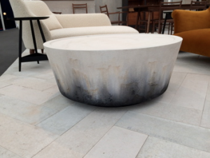 I love this coffee table by Pinch.
Have fun with coffee tables. Go for a designer shape or an unusual texture. They’re not the most expensive item in the room, so make them a conversation piece. Guests use the coffee table far more often than other pieces of furniture so give them something to talk about.
The colours in this table look like a cold version of a fire, they almost move. It’s quite mesmerising. We need things to stare at vacantly, to give our eyes a break from iPhones and tablets. Man needs fire. Not only for heat but for switching off. I think this table could be a form of meditation, don’t you?
Accessories
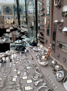 Like a child in a sweet shop, that’s how I feel when I visit the Chloe Alberry stand. It can make me quite giddy. Who knew? So easily pleased… shiny handles, petrified wood cabinet knobs, polished glass…
I think it’s how it’s all laid out though. Such precision.
And everything has to be stroked and ‘handled’.
It’s important to invest in good handles. You touch them every day. Make sure they please you, rather than have no impact on you whatsoever (such a waste) or worse still, annoy you slightly by being the wrong size or a texture that displeases you.
Same with light pulls, invest there too. It’s these details that can make you happy in your decor. You have to have these accessories so make them please you. Why not?
Lighting
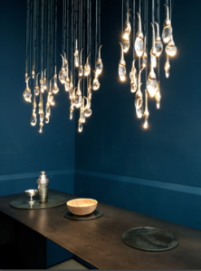 Such simplicity on the table so all the attention goes to the magnificence of the light above. I love it. And I love the blue background too (there was a LOT of blue in the shows this year).
Pendants are wonderful sources of both light and sculpture in a room. They can be breath takingly expensive but unfortunately, (unlike with some items you can get away with) I find the cheap ones look just that… cheap.
This one is not cheap. Obviously.
When choosing pendants bear in mind the height of your room. Tall ceilings are such a treat. The last thing you need is to be walking into light fittings (I did this just last week on a consultation!)
And don’t forget the height of the fixture still needs the height of the chain above it (often at least 30cm). Only ‘semi-flush’ pendants should be close to the ceiling.
Outdoor
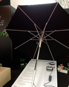

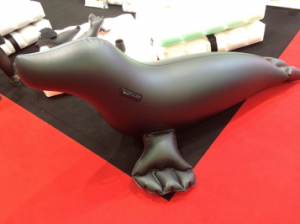 Some fun for outdoors: lights along the spokes of the parasol and an inflatable seal. If only summer could last forever…
There were lots of inflatable sofas and armchairs too which could be a one hit wonder for the summer unless you’re sensible enough to deflate them and store them safe and dry. Somehow this never works in our house…
Bathrooms
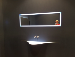
Another glorious basin (they get sexier every year) that looks incredible against the clean, black wall of a show setting but might not have the same impact in your home (unless you can maintain matt black painted splash backs in your bathroom!)
Clever lighting and design deceives the eye and it’s hard to work out where the basin starts and the wall ends.
These are the kinds of basin you find in fabulous restaurants but are slightly nervous about using. At least the taps are obvious. Although I do find it amusing watching people trying to work out how to operate taps. They wave at them and prod and poke them, forgetting the ‘old fashioned’ methods of simply turning them on.
Key Trend
Concrete was everywhere – basins, work surfaces, chairs. If it wasn’t real concrete then it looked like concrete in fabrics, wallpaper effects or laminate tiling.
I personally like the look of concrete, especially polished but it has its downsides. It is cold – both looking and to the touch. And it is incredibly unforgiving when it comes to dropping anything on it. The cup will smash and that’s the end of that. On the other hand, it’s pretty easy to mop!
Children’s Rooms
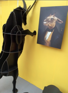 A splash of colour and some fun to end with. What do you think of this bookshelf?
I believe that if we can persuade children to notice the books, they’re more inclined to read them.
What better a way to bring attention to books than with these fun shelves? (There’s also a polar bear in… yes, blue).
Designing children’s rooms is a delicate balance of form and function. We want them to work and play there but also to sleep soundly. Make sure your children’s rooms aren’t too lurid. You don’t want them up all night because of an overly zealous paint choice or wild action wallpaper.
On the other hand, kids should be proud of their rooms. They can’t be an extension of the adult taste (all taupe and concrete, darling). After all, pride might just bring about responsibility and before you know it, you’ll have sons and daughters who tidy up after themselves.
Obviously I’m joking. That will never happen…
If you want to discuss any of the above and have a project that needs some professional help, please get in touch via email or social media.
niki@nsid.co.uk
@nikischafer
www.nikischaferinteriordesign.co.uk
- Category :
- Type :




Comments
Just Say Your Opinion